Exploratory data analysis with Danfo.js and JavaScript

Recently, I published a free web-based lightweight data exploration app DataCabin using Danfo.js, a powerful JavaScript library for data manipulation and analysis. I was inspired by libraries such as SweetViz, Pandas Profiling / ydata-profiling and AutoViz.
These libraries automate the process of Exploratory Data Analysis (EDA) by generating comprehensive reports and visualisations, I was curious to find out if something like this could be done using only JavaScript and be incorporated into a web based tool a user could interect with. This would allow a user to analyse small to medium sized datasets (maybe less than 20,000 rows) even without knowing any code.
Through this process, I learned valuable lessons about EDA, data processing and visualisation using JavaScript, which I’ll share in this article along with an explanation of the key Danfo.js functions I used in the app. Danfo.js in the wild so to speak 😆 At the start of this article I list all of the Danfo.js functions I used throughout this article and in the project.

Why Danfo.js?
Danfo.js is a library similar to the Pandas package in Python, making it easier to handle data manipulation in JavaScript. It’s perfect for web-based applications that require working with datasets, providing functions for reading, transforming, and analyzing data with an intuitive syntax.
You can learn more about Danfo.js in the:
Core features of the app
The primary features of the DataCabin EDA app include:
- Uploading CSV files: The app allows users to upload CSV files and parses the data for exploration.
- Data overview: It provides an overview of the dataset, such as the number of rows, columns, missing values, and data types.
- Univariate analysis: Visualisation of individual variables, both numeric and categorical, with histograms and bar charts.
- Correlation heatmap: Shows the correlation between numeric variables in the dataset.
- Relationship plots: Scatter and table plots that compare relationships between two selected variables.
- Key influencers: View influencer statistical summaries of other variables in relation to the target variable and values.
For the frontend I used Vue.js since I like the ease of use for this frontend library. Once you have a Vue.js app ready for deployment, running the npm or yarn build command creates a static site in the dist folder, ready for deployment to a CDN or GitHub pages as a static site - very useful!
The first step was importing the package into the Vue app. This gives us a reference to it as 'dfd'. Other useful packages were Plotly for charting and Axios for HTTP requests.
import * as dfd from "danfojs";
import Plotly from "plotly.js-dist-min";
import axios from "axios";
Danfo functions used
Now let's take a look at some of the key functions I used from Danfo. You'll see these referenced as we progress through the article. For any others you can take a look at the Danfo API reference.
dfd.readCSV(this.dropFiles): Reads a CSV file and converts it into a DataFrame.df.selectDtypes(["int32", "float32"]): Selects columns with numeric data types (integers, floats).df.selectDtypes(["string"]): Selects columns with string (categorical) data types.df.isNa(): Identifies missing values in the DataFrame.df.sum(): Sums values across the DataFrame, used for calculating missing values.df.iloc({ rows: [i] }): Retrieves data from specific rows in the DataFrame.df.ctypes: Gets the data types of the DataFrame's columns.df.column(column).unique(): Finds unique values in a specific column.df.column(column).mean(): Calculates the mean of a numeric column.df.query(): Filters the DataFrame based on conditions (e.g., matching specific values).df.column(column).valueCounts(): Counts occurrences of unique values in a column.df.drop({ columns: columnsToDrop, inplace: true }): Drops specific columns from the DataFrame.dfd.getDummies(df): Converts categorical variables into dummy/indicator variables for analysis.
Reading CSV files
dfd.readCSV(this.dropFiles).then((df) => { ... });
One of Danfo.js’s most crucial features is reading CSV files. Using readCSV, I was able to load a dataset, analyse its shape, and then proceed with deeper analyses. After loading the CSV, the dataset was stored in a DataFrame object (similar to Pandas), allowing further operations like filtering, grouping, and transforming the data.
Initial processing
After the CSV dataset is uploaded, this triggers a Vue watcher aimed at the dropFiles variable from Buefy. This processes the data and calculates summary statistics to give a basic data overview. It's quite a long function since it does most of the heavy lifting.
- The code reads an uploaded CSV file, converts it into a DataFrame using Danfo.js, and stores the raw data for processing.
- It calculates key dataset statistics like the number of rows, columns, and data types, and separates numeric and categorical columns.
- The code identifies missing values, duplicate rows, and computes their percentages, storing this info in a dataInfo object.
- High-cardinality columns (with many unique values) and binary columns (with only two unique values) are flagged, and warnings are generated.
- The processed data and insights are then stored for further analysis within the Vue application using 'this.dataInfo' and 'this.df'
watch: {
    /*
     Reads the given CSV file when the upload input
     changes. Parses the CSV and calculates dataset
     statistics.
     */
    dropFiles() {
      if (this.dropFiles == null) {
        return;
      }

      if (this.dropFiles.length < 1) {
        return;
      }

      console.log("this.dropFiles", this.dropFiles);
      console.log("this.dropFiles[0]", this.dropFiles[0])

      const reader = new FileReader();

      reader.readAsText(this.dropFiles);

      reader.onload = () => {
        this.rawCSVData = reader.result; // contains the file content as a string
      };

      console.log("this.rawCSVData", this.rawCSVData);

      reader.onerror = () => {
        console.log(reader.error);
      };

      dfd.readCSV(this.dropFiles).then((df) => {
        let dfShape = df.shape;

        let numericColumns = df.selectDtypes(["int32", "float32"]);

        let categoricalColumns = df.selectDtypes(["string"]);
        let totalMissingValues = df
          .isNa()
          .sum()
          .values.reduce((a, b) => a + b, 0);

        let rows = [];
        let duplicateRows = [];

        for (let i = 0; i < dfShape[0]; i++) {
          let row = df.iloc({ rows: [i] }).$data[0];

          if (rows.includes(JSON.stringify(row))) {
            duplicateRows.push(row);
          }

          rows.push(JSON.stringify(row));
        }

        let dataInfo = {
          numberOfRows: dfShape[0],
          numberOfColumns: dfShape[1],
          columns: df.columns,
          dtypes: df.ctypes,
          numColumns: numericColumns,
          catColumns: categoricalColumns,
          missingValuesByColumn: df.isNa(),
          totalMissingValues: totalMissingValues,
          "missingValues%": (
            (totalMissingValues / (dfShape[0] * dfShape[1])) *
            100
          ).toFixed(2),
          duplicateRows: duplicateRows.length,
          "duplicateRows%": ((duplicateRows.length / dfShape[0]) * 100).toFixed(
            2
          ),
        };

        console.log("dataInfo", dataInfo);

        // Identify high cardinality categoric columns
        this.influencerColumns = [...dataInfo["numColumns"].columns];
        for (let column of dataInfo["catColumns"].$columns) {
          let uniqueValuesCount = df.column(column).unique().$data.length;

          if (uniqueValuesCount > 10) {
            this.highCardinalityColumns.push(column);
          } else {
            this.influencerColumns.push(column);
          }
        }

        let warnings = [];

        for (let column of dataInfo["columns"]) {
          let missingValues =
            dataInfo["missingValuesByColumn"][column].valueCounts();
          let uniqueValuesCount = df.column(column).unique().$data.length;

          if (uniqueValuesCount == 2) {
            warnings.push(
              `<b>${column}</b> appears to be a binary variable: 2 values`
            );
          }

          if (uniqueValuesCount > 10) {
            warnings.push(
              `<b>${column}</b> has high cardinality: ${uniqueValuesCount} unique values`
            );
            this.allHighCardinalityColumns.push(column);
          }

          if (missingValues.$dataIncolumnFormat.length > 1) {
            let missingValuesCount = missingValues.$dataIncolumnFormat[1];
            let missingValuesPc = (
              (missingValuesCount / dataInfo["numberOfRows"]) *
              100
            ).toFixed(2);

            warnings.push(
              `<b>${column}</b> has ${missingValuesCount} (${missingValuesPc}%) missing values`
            );
          }
        }

        this.dataInfo = dataInfo;
        this.dataInfo.warnings = warnings;
        this.df = df;
        this.activeTab = 0;

        this.isLoading = false;
      });
    },
    relationships: {
      handler: function (newValue) {
        this.generateRelationshipPlot();
      },
      deep: true,
    },
  },
Basic data overview
let numericColumns = df.selectDtypes(["int32", "float32"]);
let categoricalColumns = df.selectDtypes(["string"]);
I used selectDtypes() to separate numeric and categorical columns. This distinction was important because numeric data often requires statistical analyses, while categorical data usually benefits from counting unique values or generating bar charts.
let totalMissingValues = df.isNa().sum().values.reduce((a, b) => a + b, 0);
The app also calculated the number of missing values using isNa() to identify columns that needed attention. This was essential for providing an overview of data quality.
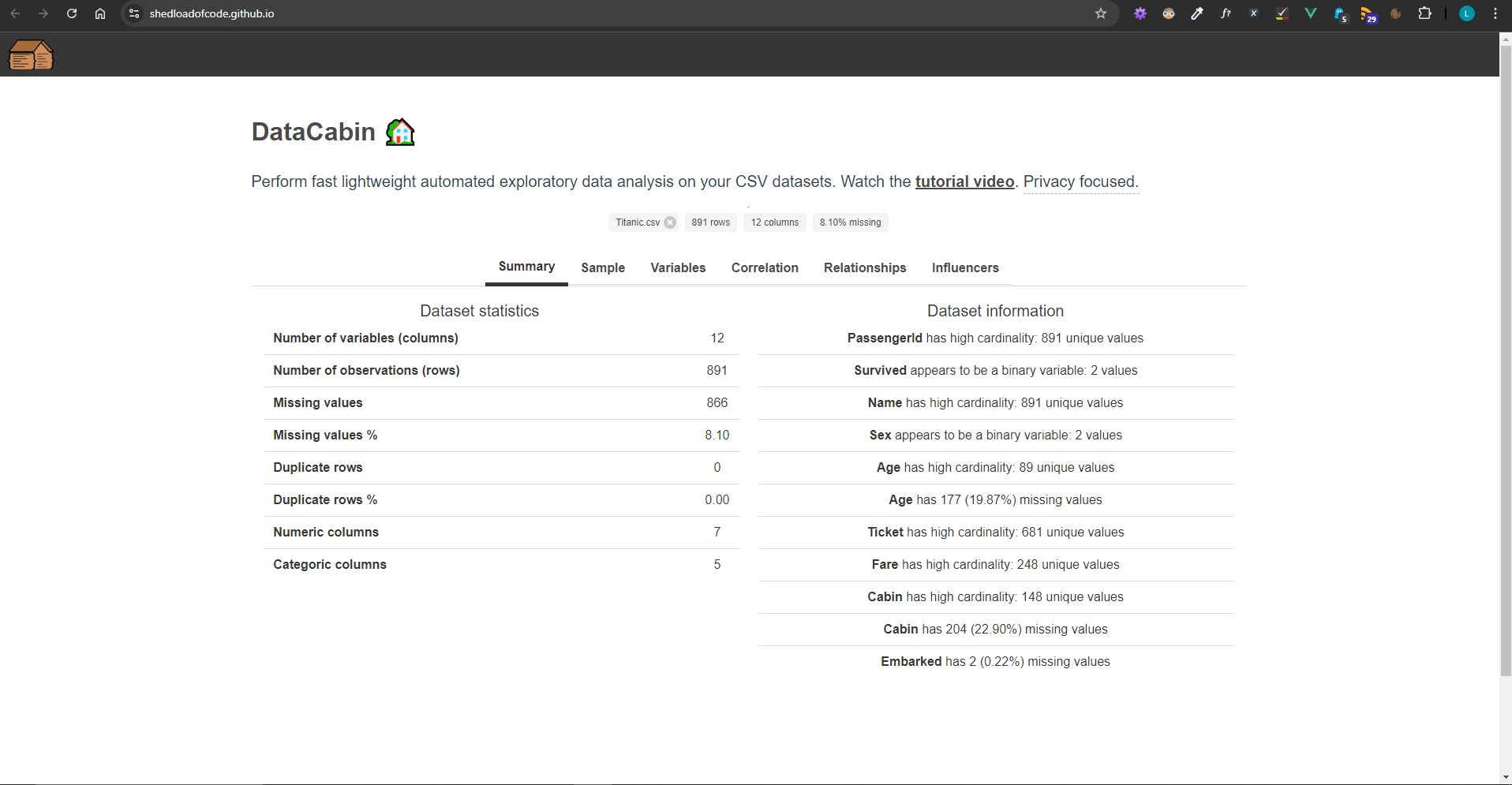
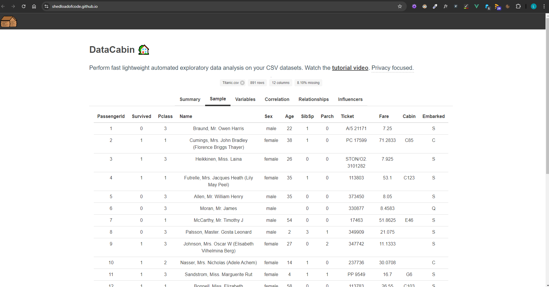
Sample table
In this section I displayed the top 20 records while ensuring to fill any missing data with a blank value. This was to ensure it rendered correctly in the HTML table.
df.head(20).fillNa('')
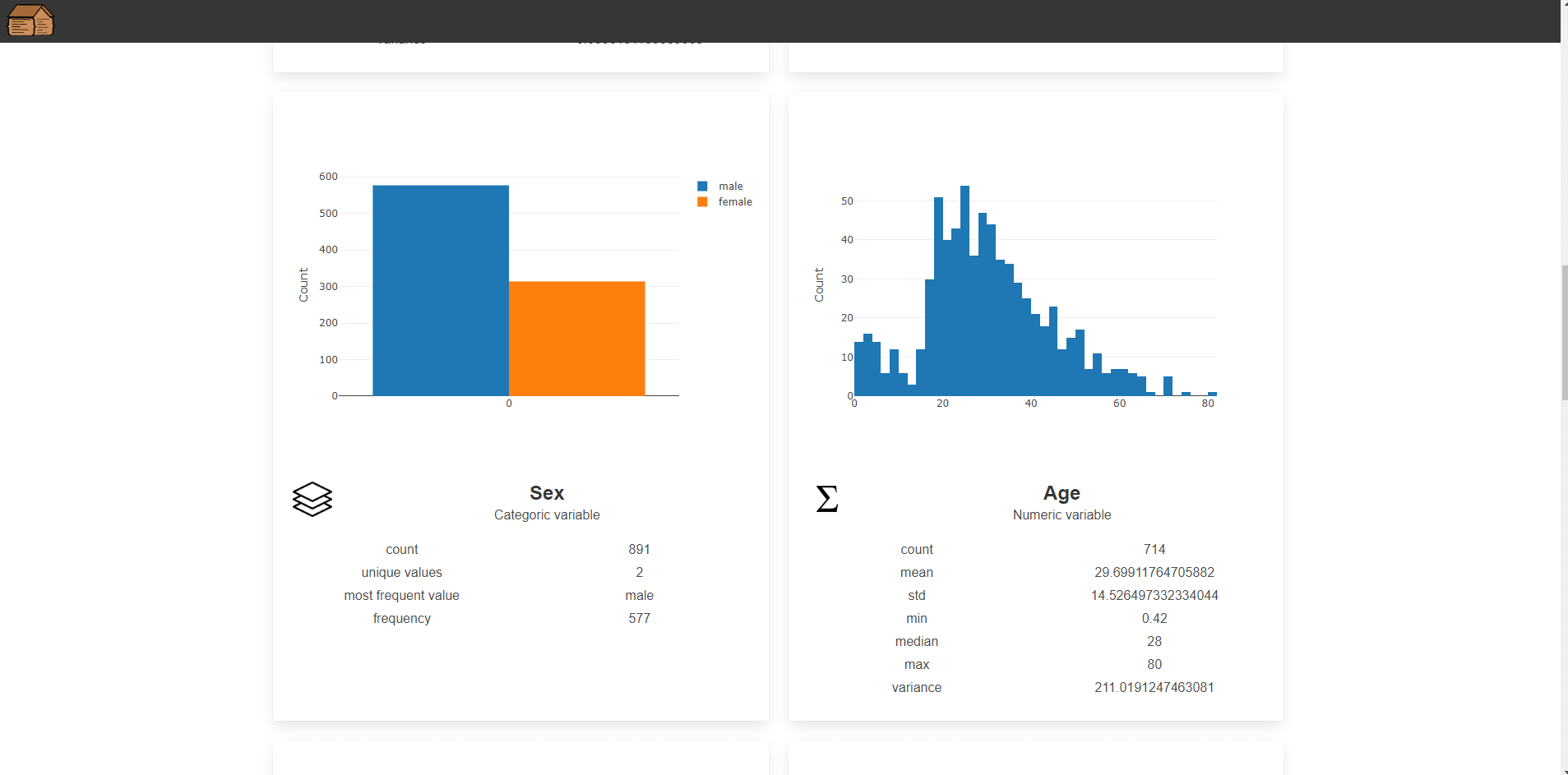
Univariate analysis
this.df[column].plot("plot_" + column.toLowerCase()).hist({ layout });
For numeric columns, I used plot().hist() to generate histograms. This provided a visual representation of the distribution of each variable, which is helpful for identifying trends and outliers.
For categorical variables, I computed value counts and displayed them in bar charts:
let counts = this.df.column(column).valueCounts();
let df = new dfd.DataFrame([counts.$data], { columns: counts.$index });
df.plot("plot_" + column.toLowerCase()).bar({ layout });
Here, valueCounts() gives the frequency of each category, which I then plotted using bar charts to display the frequency distribution of each categorical variable.
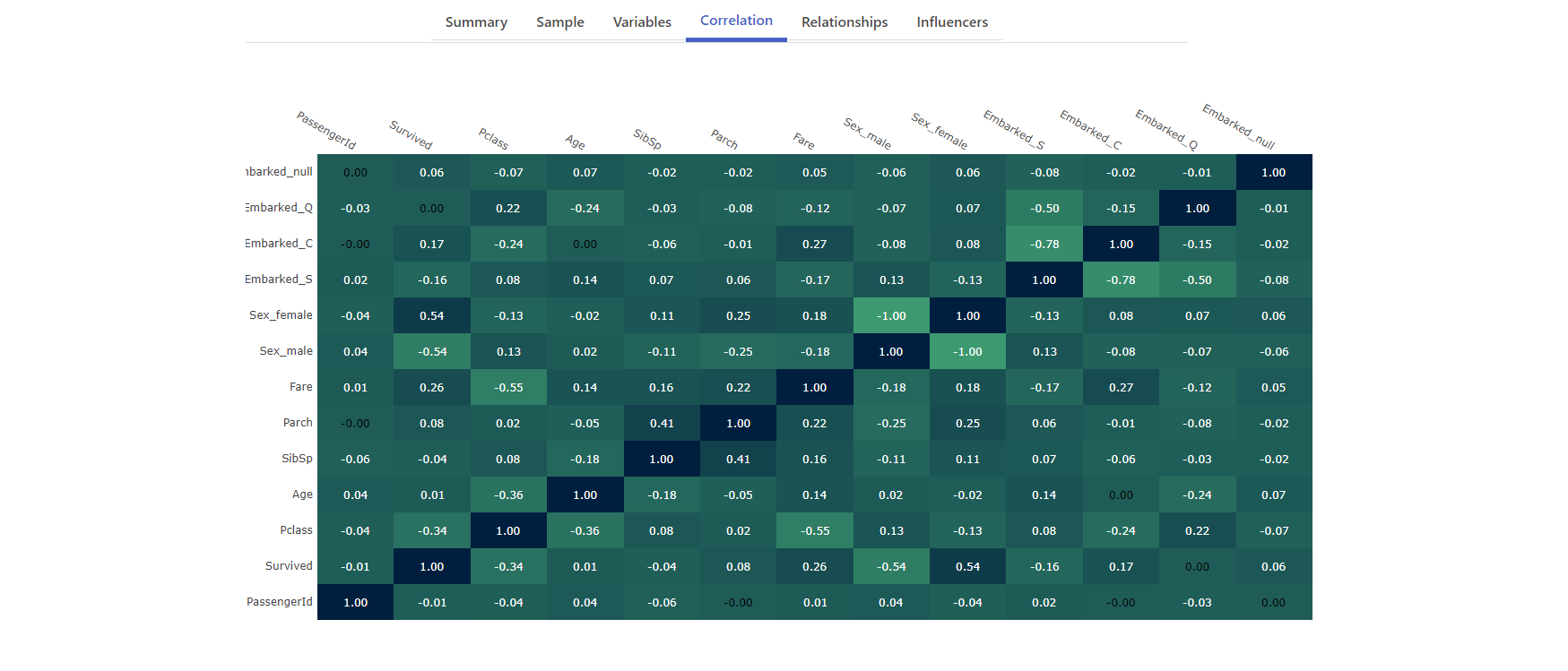
Correlation heatmap
The correlation heatmap was one of the most interesting features to implement. First, I created dummy variables for categorical columns using getDummies() to ensure all data could be treated numerically for correlation analysis.
let dummies = dfd.getDummies(df);
I created a custom corr() function to calculate the pairwise Pearson correlation between columns.
corr(x, y) {
    let sumX = 0, sumY = 0, sumXY = 0, sumX2 = 0, sumY2 = 0;
    x.forEach((xi, idx) => {
      let yi = y[idx];
      sumX += xi;
      sumY += yi;
      sumXY += xi * yi;
      sumX2 += xi * xi;
      sumY2 += yi * yi;
    });
    return ((x.length * sumXY - sumX * sumY) / Math.sqrt((x.length * sumX2 - sumX * sumX) * (x.length * sumY2 - sumY * sumY)));
}
Here, corr() is used to calculate the Pearson correlation between two arrays. The result is displayed as a heatmap using Plotly, where each cell represents the correlation between two variables.
The image below shows what this looks like in the app followed by the code to implement it in Vue. You can read more about this in the article How to create an interactive correlation heatmap using Danfo.js and Plotly.
<div id="correlation-heatmap">
    <!-- Plotly Heatmap -->
</div>
/*
     * Creates a correlation heatmap
     * https://plotly.com/javascript/heatmaps/
     */
    generateHeatmap() {
      /**
       * This needs to be in the format of
       *  zValues = [
       *     [0.00, 0.00, 0.75, 0.75, 1.00],
       *     [0.00, 0.00, 0.75, 1.00, 0.00],
       *     [0.75, 0.75, 1.00, 0.75, 0.75],
       *     [0.00, 1.00, 0.00, 0.75, 0.00],
       *     [1.00, 0.00, 0.00, 0.75, 0.00]
       *  ];
       */
      if (this.heatmapInitialised) {
        return;
      }

      let zValues = [];
      let df = this.df.copy();
      let columnsLength = this.dataInfo.columns.length;
      let columnsToDrop = [];

      // Drop columns with high cardinality (many unique values)
      for (let i = 0; i < columnsLength; i++) {
        let column = this.dataInfo.columns[i];

        // Skip if a numeric column as it will have lots of unique values
        // but this doesn't matter :)
        if (this.dataInfo["numColumns"].$columns.includes(column)) {
          continue;
        }

        let uniqueValuesCount = df.column(column).unique().$data.length;

        if (uniqueValuesCount > 5) {
          columnsToDrop.push(column);
        }
      }

      df.drop({ columns: columnsToDrop, inplace: true });

      // Create dummy columns for categoric variables
      let dummies = dfd.getDummies(df);
      // Uncomment to debug: console.log("DUMMIES", dummies);
      columnsLength = dummies.$columns.length;

      for (let i = 0; i < columnsLength; i++) {
        let column = dummies.$columns[i];
        // Uncomment to debug: console.log("COMPARING", column);
        let correlations = [];

        for (let j = 0; j < columnsLength; j++) {
          let comparisonColumn = dummies.$columns[j];
          // Uncomment to debug: console.log("TO", comparisonColumn);

          let pearsonCorrelation = this.corr(
            dummies[column].$data,
            dummies[comparisonColumn].$data
          ).toFixed(2);

          correlations.push(pearsonCorrelation);

          this.logCorrelationMessage(
            pearsonCorrelation,
            column,
            comparisonColumn
          );
        }

        zValues.push(correlations);
      }

      var xValues = dummies.$columns;
      var yValues = dummies.$columns;

      var colorscaleValue = [
        [0, "#3D9970"],
        [1, "#001f3f"],
      ];

      var data = [
        {
          x: xValues,
          y: yValues,
          z: zValues,
          type: "heatmap",
          colorscale: colorscaleValue,
          showscale: false,
        },
      ];

      var columnWidth = document.getElementById("main-column").offsetWidth - 35;

      if (!columnWidth > 0) {
        columnWidth = window.innerWidth - 750;
      }

      var layout = {
        autosize: false,
        width: columnWidth,
        height: 700,
        annotations: [],
        xaxis: {
          ticks: "",
          side: "top",
        },
        yaxis: {
          ticks: "",
          ticksuffix: " ",
          autosize: false,
        },
      };

      for (var i = 0; i < yValues.length; i++) {
        for (var j = 0; j < xValues.length; j++) {
          var currentValue = zValues[i][j];
          if (currentValue != 0.0) {
            var textColor = "white";
          } else {
            var textColor = "black";
          }
          var result = {
            xref: "x1",
            yref: "y1",
            x: xValues[j],
            y: yValues[i],
            text: zValues[i][j],
            font: {
              family: "Arial",
              size: 12,
              color: "rgb(50, 171, 96)",
            },
            showarrow: false,
            font: {
              color: textColor,
            },
          };
          layout.annotations.push(result);
        }
      }

      Plotly.newPlot("correlation-heatmap", data, layout);

      this.heatmapInitialised = true;
    }
The function generateHeatmap handles:
-
Data preprocessing and correlation calculation: The function first removes columns with high cardinality (more than five unique values) to simplify the dataset. It then creates dummy variables for categorical columns using getDummies(), and calculates Pearson correlations between pairs of columns, storing the results in a zValues array.
-
Heatmap plotting with Plotly: The correlation data (zValues) is plotted using Plotly as a heatmap, where each cell represents the correlation between two variables. The heatmap is customised with specific colors and annotations that display correlation values in each cell.
-
Layout and scaling: The heatmap layout dynamically adjusts to the screen size, and annotations (values in the heatmap cells) are colored based on the correlation value, providing a visually informative representation of the correlations between variables.
Relationship plots
Another key feature was plotting relationships between pairs of variables, which could either be numeric or categorical. For numeric pairs, scatter plots were used:
this.df.plot("relationship-plot").scatter({ config: { x: variableA, y: variableB } });
For categorical pairs, I created grouped tables showing the distribution:
let group = this.df.loc({ columns: [variableA, variableB] }).groupby([variableA, variableB]).size();
group.plot("relationship-plot").table();
This allows users to explore relationships between two categorical variables through tabular summaries.
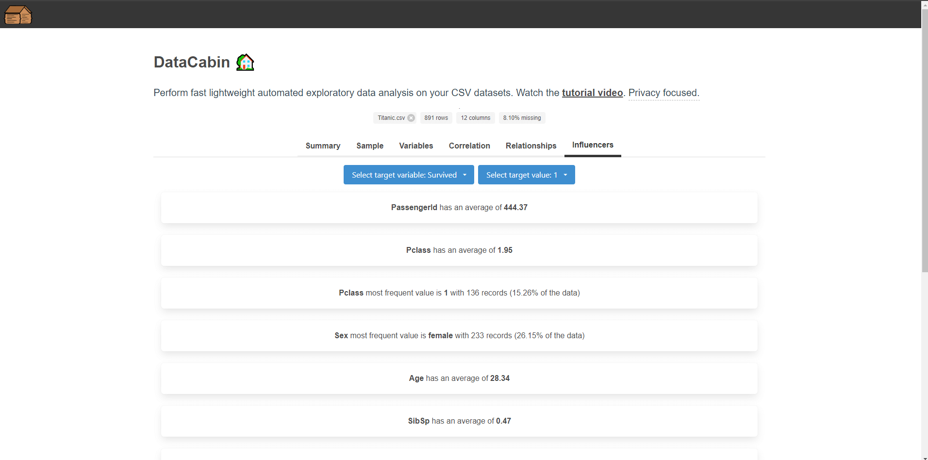
Key influencers
For the key influencers the idea is that selecting a categorical variable or a variable with low cardinality we ask what influences this to be A, B, C etc. whereas if we select a numeric variable we ask what influences this to be higher or lower.
My inspiration for this was the Power BI key influencers visual albeit a simplified version to understand averages and frequent counts in other columns.
This allows us to figure out what are the main influencers driving a particular variable. It helps to highlight further avenues for deeper analyis, and ask the right questions of our datasets.
The code and logic for this section is long so I won't share it here. In general I have two functions that handle categoric or continous variables:
generateInfluencerResults()
Trigger and setup: This function starts after a short delay and checks if a specific variable and value (influencer) are selected. If they are not, it exits early.
Querying data: It filters the dataset based on the selected influencer variable and value. For numeric values labeled "Higher" or "Lower", it calls another function, generateContinuousInfluencerResults().
Summarizing results: For each column, it calculates either the average (for numeric columns) or the most frequent value and its percentage (for categorical columns), ignoring irrelevant columns.
generateContinuousInfluencerResults()
Filter based on mean: This function filters rows where the selected variable is either 20% higher or lower than its mean, depending on the user's selection ("Higher" or "Lower").
Calculating averages: For numeric columns, it calculates and displays the average values of other columns in the filtered data.
Frequent value analysis: For categorical columns, it finds the most frequent value, the number of occurrences, and its percentage of the total dataset.
Lessons learned
Learning curve: The main lesson learnt is that if you've used Pandas in Python, you'll likely feel at home using Danfo. This is a major strength of the package and makes it quick to get started coming from Python to try JavaScript.
Flexibility with data types: Danfo.js handles multiple data types well, but understanding the nuances between numeric and categorical data is crucial. Making decisions about how to process each type is key to effective data exploration.
Visualisation matters: While Danfo.js provides some basic plotting capabilities, and the base plots use Plotly, integrating it directly with Plotly allows for more advanced visualisations. This combination is powerful when creating interactive and informative apps.
Custom functions are sometimes required: This is a similar finding in most other data analysis packages. Danfo.js provides many built-in functions, but sometimes you need custom logic for specific tasks, such as calculating correlations or managing categorical relationships.
Scalability and performance: While Danfo.js is efficient, handling large datasets with many unique categorical values can slow things down. I learned to filter out high-cardinality columns and simplify the data when necessary for performance reasons.
Generic data vs specific: The data explorer app needed to handle most datasets without seeing them first, this posed it's own challenges. Whereas if you tailored Danfo.js to a specific dataset you could leverage it's capabilities more effectively. You would know what data types to expect and wouldn't need so much preprocessing.
Conclusion
Using Danfo.js to build this data explorer app was an exciting challenge. The library’s ability to handle data manipulation and analysis directly in JavaScript was super useful, especially for web-based data exploration.
I am still very impressed by how far JavaScript and the Danfo package has come, I really didn't think something comparable to Pandas and Python would be available in JavaScript but there it is! By leveraging its core features and integrating it with external visualisation libraries, I was able to create a fully functional app for quickly analysing datasets, which I plan to continue improving and using myself.
Thanks for reading, I hope this helped you in your own data analysis and visualisation projects 😄
As always, if you enjoyed this article be sure to check out other articles on the site including: