Making GOV.UK style plots with Python and R
Finding examples of clear, accessible, and visually appealing charts is crucial when creating your own charts to communicate data-driven insights, especially in a context with a wide audience. I've always admired the simple, clear and accessible format of GOV.UK charts to strike the perfect balance between detail and clarity. Also a big fan of the GOV Design System as a good example of simple yet effective styling.
This guide demonstrates how to generate GOV.UK style plots using Python and R, leveraging best practices and official guidance. The lessons learnt from producing these charts can help you to keep your own analysis and insights clear and effective. The examples include mostly static charts, including line and bar charts, scatter plots, and choropleth maps, formatted in the GOV.UK style.
These should cover 90% of data visualisation needs and keeps things simple which is perfect for clearly communicating insights. Not to mention, this article is loaded with examples in each to cover lots of use cases, using both Python and R. Enjoy!
Versions used
You can download the latest versions of Python, Visual Studio Code, R and RStudio below. I've also added the specific versions I used at the time of writing.
Python version: 3.12.2 from https://www.python.org/downloads/ and using Visual Studio Code as the IDE.
R version: 4.4.1 from https://cran.rstudio.com/ and RStudio as the IDE.
Libraries used
-
Python Libraries:
numpy,pandas,matplotlib,seaborn,plotly,scikit-learn,folium,geopandas -
R Libraries:
tidyverse,ggplot2,govstyle
These libraries support creating both static and interactive visualisations, making them ideal for producing accessible and visually appealing charts for different media. In this article, we'll be covering mainly static charts, but if you're interested in interactive visualisations check out How to create animated charts with Python and Plotly .
Setting Up the Environment
Python Setup
For Python, install the required libraries:
pip install numpy pandas matplotlib seaborn plotly pandas
For maps, we would also need:
pip install folium geopandas pandas
R Setup
For R, install the tidyverse, ggplot2 and optionally govstyle packages:
install.packages("tidyverse")
install.packages("ggplot2")
install.packages('devtools')
devtools::install_github('ukgovdatascience/govstyle')
During my research into this topic, the govstyle package seems specifically tailored for producing GOV.UK-compliant visuals, making it an appealing option for R users. This is optional though, you can still create similar charts without it.
Downloading Data
The data used in this article is not real data, so it is all dummy data but based on real datasets for learning purposes. It also makes it easy for you to try these out yourself using the code snippets.
You can find statistics and figures at the UK’s Office for National Statistics (ONS) site. For example, employment data over the past few years or regional population data.
- Download ONS datasets from ONS website.
- Import using
pandasin Python orreadrin R.
Line Chart
Python Example
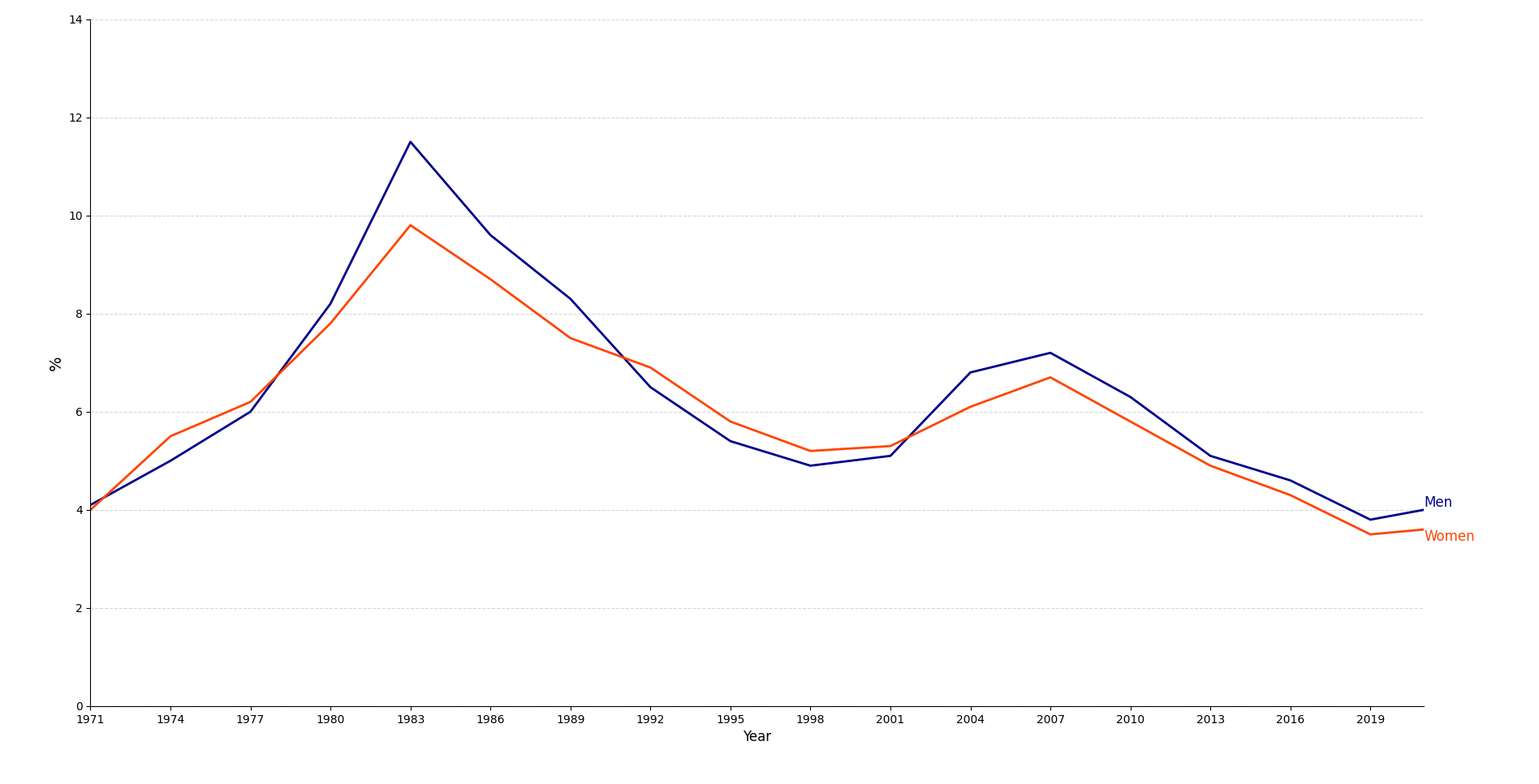
import matplotlib.pyplot as plt

# Adjusted years list to match the length of rate lists
years = [1971, 1974, 1977, 1980, 1983, 1986, 1989, 1992, 1995, 1998, 2001, 2004, 2007, 2010, 2013, 2016, 2019, 2021]
men_rate = [4.1, 5.0, 6.0, 8.2, 11.5, 9.6, 8.3, 6.5, 5.4, 4.9, 5.1, 6.8, 7.2, 6.3, 5.1, 4.6, 3.8, 4.0]
women_rate = [4.0, 5.5, 6.2, 7.8, 9.8, 8.7, 7.5, 6.9, 5.8, 5.2, 5.3, 6.1, 6.7, 5.8, 4.9, 4.3, 3.5, 3.6]

# Create the figure and axis
fig, ax = plt.subplots(figsize=(10, 6))

# Plotting the two lines
ax.plot(years, men_rate, label='Men', color='darkblue', linewidth=2)
ax.plot(years, women_rate, label='Women', color='orangered', linewidth=2)

# Adding labels directly on the lines
ax.text(years[-1], men_rate[-1], 'Men', fontsize=12, verticalalignment='bottom', color='darkblue')
ax.text(years[-1], women_rate[-1], 'Women', fontsize=12, verticalalignment='top', color='orangered')

# Setting axis labels and title
ax.set_ylabel('%', fontsize=14)
ax.set_xlabel('Year', fontsize=12)

# Remove top and right spines for a cleaner look
ax.spines['top'].set_visible(False)
ax.spines['right'].set_visible(False)

# Enable horizontal gridlines only
ax.yaxis.grid(True, linestyle='--', alpha=0.5)
ax.xaxis.grid(False)

# Set y-axis limits and x-ticks
ax.set_ylim(0, 14)
ax.set_xticks(list(range(1971, 2022, 3)))  # Set x-tick intervals
ax.set_xlim(1971, 2021)

# Show the plot
plt.tight_layout()
plt.show()
R Example
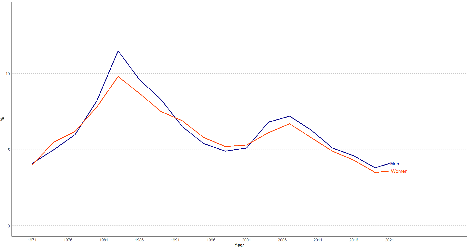
library(ggplot2)

# Define the data
years <- c(1971, 1974, 1977, 1980, 1983, 1986, 1989, 1992, 1995, 1998, 2001, 2004, 2007, 2010, 2013, 2016, 2019, 2021)
men_rate <- c(4.1, 5.0, 6.0, 8.2, 11.5, 9.6, 8.3, 6.5, 5.4, 4.9, 5.1, 6.8, 7.2, 6.3, 5.1, 4.6, 3.8, 4.1)
women_rate <- c(4.0, 5.5, 6.2, 7.8, 9.8, 8.7, 7.5, 6.9, 5.8, 5.2, 5.3, 6.1, 6.7, 5.8, 4.9, 4.3, 3.5, 3.6)

# Create a data frame to hold the values
data <- data.frame(
  Year = rep(years, 2),
  Rate = c(men_rate, women_rate),
  Gender = rep(c("Men", "Women"), each = length(years))
)

# Generate the plot using ggplot2
p <- ggplot(data, aes(x = Year, y = Rate, color = Gender, group = Gender)) +
  geom_line(size = 1.2) +  # Adjust line thickness
  geom_text(data = subset(data, Year == 2021), aes(label = Gender), hjust = -0.1, size = 5) +
  scale_color_manual(values = c("Men" = "darkblue", "Women" = "orangered")) +
  labs(x = "Year", y = "%", title = NULL) +
  theme_minimal() +  # Minimal theme
  theme(
    panel.grid.major.y = element_line(linetype = "dashed", color = "gray", size = 0.5),  # Horizontal gridlines
    panel.grid.major.x = element_blank(),  # Remove vertical gridlines
    panel.grid.minor = element_blank(),  # Remove minor gridlines
    axis.line = element_line(color = "black"),  # Add black axis lines
    axis.title = element_text(size = 14),
    axis.text = element_text(size = 12),
    legend.position = "none"  # Remove legend
  ) +
  coord_cartesian(ylim = c(0, 14)) +  # Match y-axis limits
  scale_x_continuous(limits = c(1971, 2029), breaks = seq(1971, 2025, by = 5))  # Extend x-axis to 2025

# Display the plot
print(p)
Python comparison subplots example
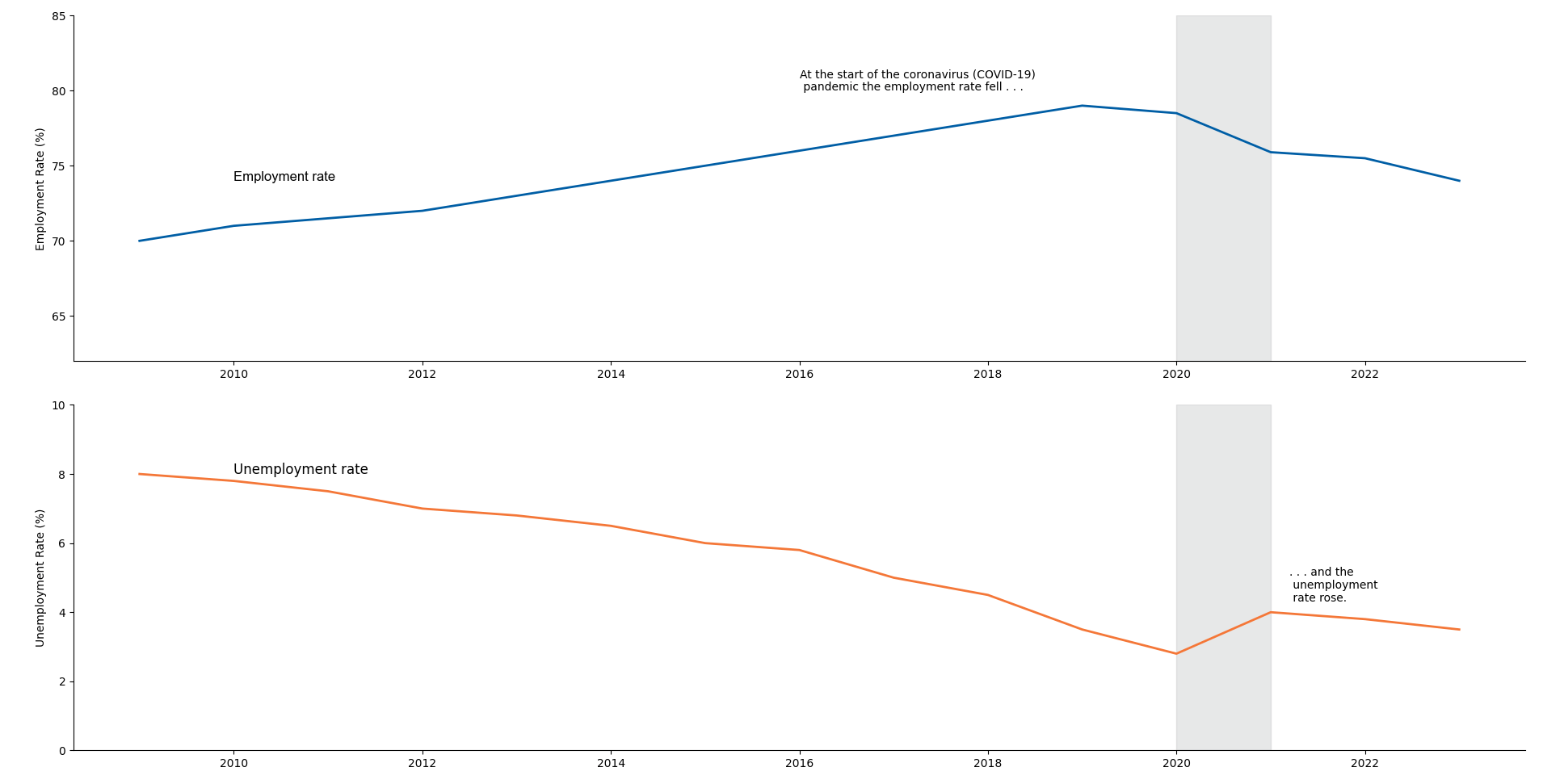
This can also be used for interrupted time series analysis to understand the effect of an intervention.
import matplotlib.pyplot as plt
import pandas as pd

data = pd.DataFrame({
    'Year': list(range(2009, 2024)),
    'Employment Rate': [70, 71, 71.5, 72, 73, 74, 75, 76, 77, 78, 79, 78.5, 75.9, 75.5, 74],
    'Unemployment Rate': [8, 7.8, 7.5, 7, 6.8, 6.5, 6, 5.8, 5.0, 4.5, 3.5, 2.8, 4, 3.8, 3.5]
})

fig, (ax1, ax2) = plt.subplots(2, 1, figsize=(12, 8), sharex=False)

ax1.plot(data['Year'], data['Employment Rate'], color='#005EA5', linewidth=2)
ax1.text(2010, 74, 'Employment rate', fontname="Arial", fontsize=12, color='black')
ax1.set_ylabel('Employment Rate (%)')
ax1.axvspan(2020, 2021, color='#b1b4b6', alpha=0.3)  # Highlight for COVID-19 period
ax1.text(2016, 80, 'At the start of the coronavirus (COVID-19)\n pandemic the employment rate fell . . .', fontsize=10)
ax1.set_ylim(62, 85)

ax2.plot(data['Year'], data['Unemployment Rate'], color='#f47738', linewidth=2)
ax2.text(2010, 8, 'Unemployment rate', fontsize=12, color='black')
ax2.set_ylabel('Unemployment Rate (%)')
ax2.axvspan(2020, 2021, color='#b1b4b6', alpha=0.3)  # Highlight for COVID-19 period
ax2.text(2021.2, 4.3, '. . . and the\n unemployment\n rate rose.', fontsize=10)
ax2.set_ylim(0, 10)

for ax in [ax1, ax2]:
    ax.spines['top'].set_visible(False)
    ax.spines['right'].set_visible(False)

plt.tight_layout()
plt.show()
Python focus line chart example
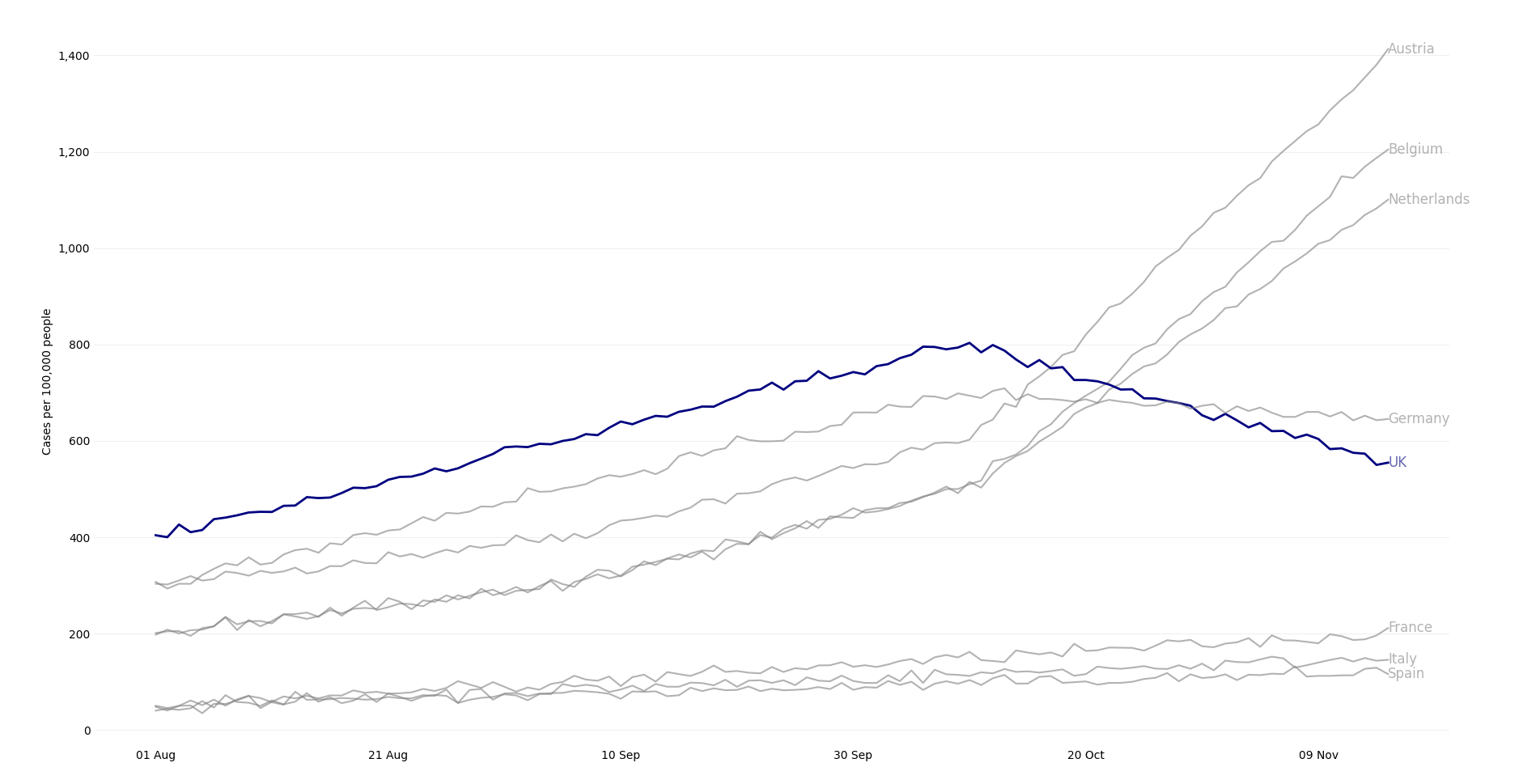
import matplotlib.pyplot as plt
import pandas as pd
import numpy as np
from matplotlib.ticker import FuncFormatter
from matplotlib.dates import DateFormatter

# Generating sample data to match the given plot pattern
np.random.seed(42)  # For reproducibility

# Generate dates
dates = pd.date_range(start="2021-08-01", end="2021-11-15")

# Adjusting the synthetic data lengths to match the number of dates (107 entries)
num_dates = len(dates)

# Create synthetic data with similar trends for each country
data = {
    "Austria": np.concatenate([np.linspace(300, 400, num_dates//3), np.linspace(400, 600, num_dates//3), np.linspace(600, 1400, num_dates - 2*(num_dates//3))]),
    "Belgium": np.concatenate([np.linspace(200, 300, num_dates//3), np.linspace(300, 500, num_dates//3), np.linspace(500, 1200, num_dates - 2*(num_dates//3))]),
    "Netherlands": np.concatenate([np.linspace(200, 300, num_dates//3), np.linspace(300, 500, num_dates//3), np.linspace(500, 1100, num_dates - 2*(num_dates//3))]),
    "UK": np.concatenate([np.linspace(400, 600, num_dates//3), np.linspace(600, 800, num_dates//3), np.linspace(800, 550, num_dates - 2*(num_dates//3))]),
    "Germany": np.concatenate([np.linspace(300, 500, num_dates//3), np.linspace(500, 700, num_dates//3), np.linspace(700, 650, num_dates - 2*(num_dates//3))]),
    "France": np.linspace(50, 200, num_dates),
    "Italy": np.linspace(50, 150, num_dates),
    "Spain": np.linspace(50, 120, num_dates)
}

# Adding slight variability (smaller noise) to each line to make them less smooth
for country in data:
    noise = np.random.normal(0, 7, num_dates)  # Adding random noise with mean 0 and standard deviation 7
    data[country] += noise

# Create DataFrame
df = pd.DataFrame(data, index=dates)

# Function to format y-axis labels with commas
def y_format(x, pos):
    return f'{int(x):,}'

# Plotting the data
plt.figure(figsize=(12, 6))
for country in df.columns:
    color = 'navy' if country == "UK" else 'grey'
    alpha_value = 1 if country == "UK" else 0.6  # Set higher transparency for non-UK lines
    plt.plot(df.index, df[country], label=country, linewidth=2 if country == "UK" else 1.5, color=color, alpha=alpha_value)

# Add country names at the end of each line
for country in df.columns:
    plt.text(df.index[-1], df[country].values[-1], country, fontsize=12, color='navy' if country == "UK" else 'grey', alpha=alpha_value, va='center')

# Formatting the plot to match the visual style
plt.xlabel(None)
plt.ylabel("Cases per 100,000 people")
plt.title(None)

# Customizing x-axis date format
date_format = DateFormatter("%d %b")  # Format as "01 Aug", "21 Aug", etc.
plt.gca().xaxis.set_major_formatter(date_format)

# Customizing the y-axis format to include commas
plt.gca().yaxis.set_major_formatter(FuncFormatter(y_format))

# Set x-tick intervals to match the original chart
plt.xticks(pd.to_datetime(['2021-08-01', '2021-08-21', '2021-09-10', '2021-09-30', '2021-10-20', '2021-11-09']), rotation=0)

# Customizing the horizontal gridlines to be faint grey
plt.grid(axis='y', color='lightgrey', linestyle='-', linewidth=0.5, alpha=0.5)

# Remove all spines
for spine in plt.gca().spines.values():
    spine.set_visible(False)

# Remove x and y axis tick marks
plt.tick_params(axis='both', which='both', length=0)  # Set the length of tick marks to 0

# Remove legend
plt.legend().set_visible(False)

# Display the plot
plt.tight_layout()
plt.show()
Bar Chart
Python Example
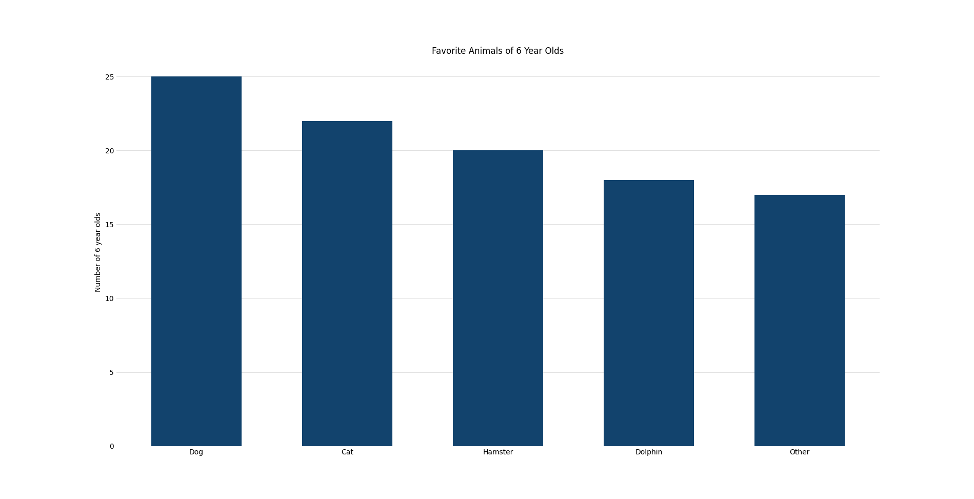
import matplotlib.pyplot as plt

# Data
categories = ['Dog', 'Cat', 'Hamster', 'Dolphin', 'Other']
values = [25, 22, 20, 18, 17]

# Create the plot
plt.figure(figsize=(12, 6))
plt.bar(categories, values, color='#12436D', width=0.6, zorder=3)

# Adding faint horizontal grey gridlines
plt.grid(axis='y', color='#e0e0e0', linestyle='-', linewidth=0.7, zorder=0)

# Remove all spines
for spine in plt.gca().spines.values():
    spine.set_visible(False)

# Remove x and y axis tick marks
plt.tick_params(axis='both', which='both', length=0)  # Set the length of tick marks to 0

# Adding labels and title
plt.ylabel('Number of 6 year olds')
plt.xlabel('')
plt.title('Favorite Animals of 6 Year Olds')
plt.show()
R Example
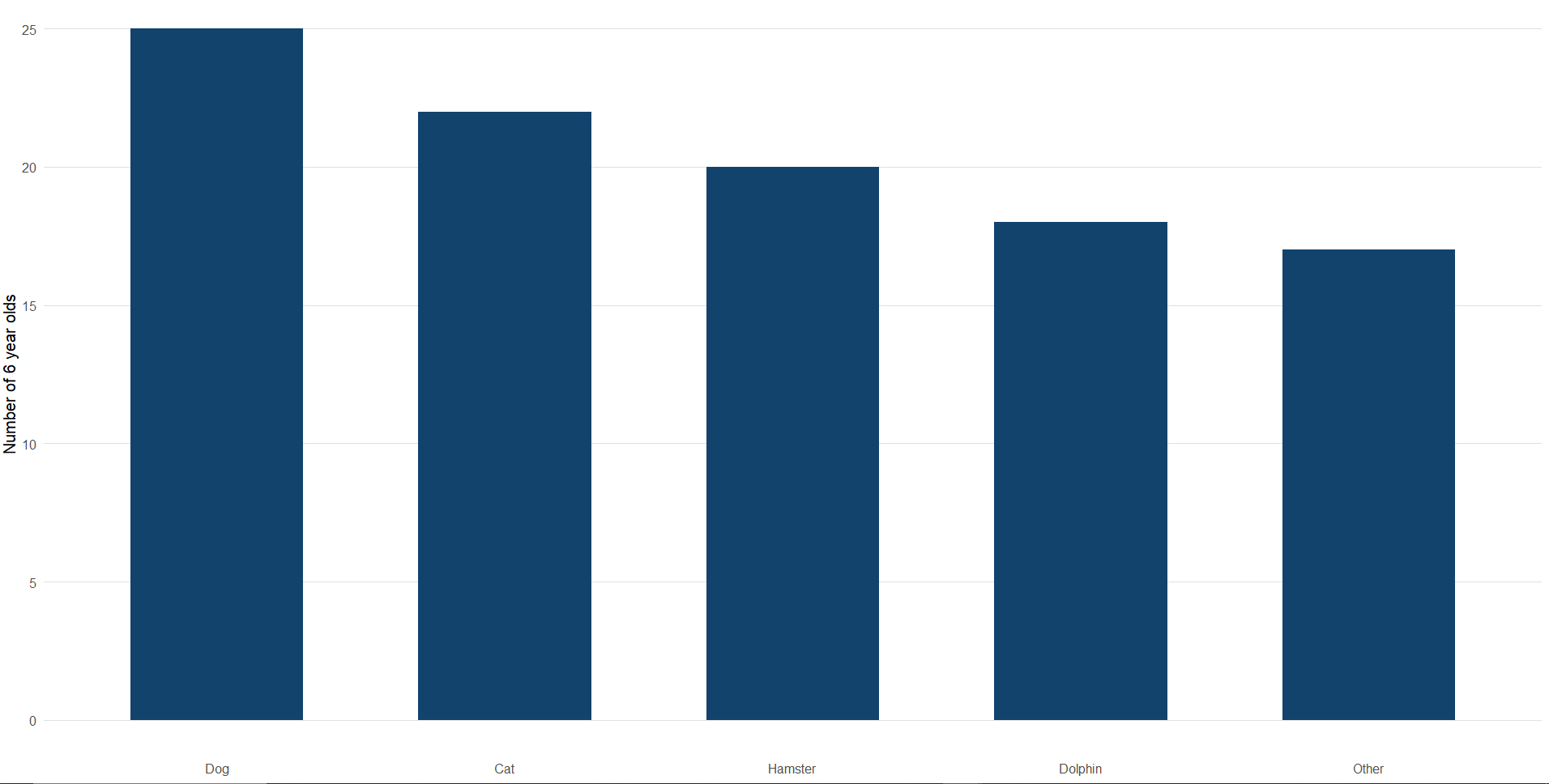
# Load necessary library
library(ggplot2)

# Data
categories <- c("Dog", "Cat", "Hamster", "Dolphin", "Other")
values <- c(25, 22, 20, 18, 17)

# Create a data frame
data <- data.frame(categories, values)

# Reorder categories based on values (largest to smallest)
data$categories <- factor(data$categories, levels = data$categories[order(-data$values)])

# Create the plot
ggplot(data, aes(x = categories, y = values)) +
  geom_bar(stat = "identity", fill = "#12436D", width = 0.6) +  # Dark blue bars with custom width
  theme_minimal(base_size = 15) +  # Minimal theme with base text size
  theme(
    panel.grid.major.y = element_line(color = "#e0e0e0", size = 0.7),  # Faint horizontal gridlines
    panel.grid.minor = element_blank(),  # Remove minor gridlines
    panel.grid.major.x = element_blank(),  # Remove vertical gridlines
    axis.ticks = element_blank(),  # Remove axis tick marks
    axis.line = element_blank(),  # Remove axis lines
    plot.title = element_text(hjust = 0.5)  # Center the plot title
  ) +
  labs(
    x = NULL,  # Remove x-axis label
    y = "Number of 6 year olds",  # Set y-axis label
    title = "Favorite Animals of 6 Year Olds"  # Set plot title
  )
Python Comparison Example
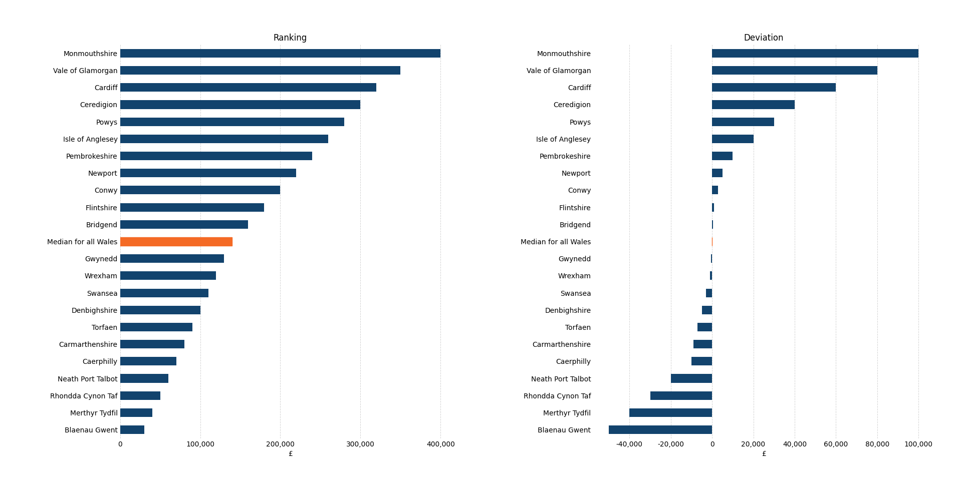
import matplotlib.pyplot as plt
import pandas as pd
import matplotlib.ticker as mticker

# Sample DataFrame
data = {
    'County': [
        'Monmouthshire', 'Vale of Glamorgan', 'Cardiff', 'Ceredigion', 'Powys', 'Isle of Anglesey',
        'Pembrokeshire', 'Newport', 'Conwy', 'Flintshire', 'Bridgend', 'Median for all Wales',
        'Gwynedd', 'Wrexham', 'Swansea', 'Denbighshire', 'Torfaen', 'Carmarthenshire',
        'Caerphilly', 'Neath Port Talbot', 'Rhondda Cynon Taf', 'Merthyr Tydfil', 'Blaenau Gwent'
    ],
    'Ranking': [
        400000, 350000, 320000, 300000, 280000, 260000, 240000, 220000, 200000, 180000, 160000,
        140000, 130000, 120000, 110000, 100000, 90000, 80000, 70000, 60000, 50000, 40000, 30000
    ],
    'Deviation': [
        100000, 80000, 60000, 40000, 30000, 20000, 10000, 5000, 3000, 1000, 500, 0,
        -500, -1000, -3000, -5000, -7000, -9000, -10000, -20000, -30000, -40000, -50000
    ]
}

# Create DataFrame
df = pd.DataFrame(data)

# Set the county names as the index
df.set_index('County', inplace=True)

# Set the figure size with increased width to accommodate labels
fig, (ax1, ax2) = plt.subplots(ncols=2, figsize=(18, 8))

# Plot the Ranking bar chart
df.sort_values('Ranking', ascending=True).plot.barh(
    y='Ranking', ax=ax1, color='#12436D', legend=False, zorder=3
)
ax1.set_title('Ranking')
ax1.set_xlabel('£')

# Highlight the "Median for all Wales" row in the specified color (#f46a25)
median_index = df.index.get_loc('Median for all Wales')
ax1.get_children()[median_index].set_color('#f46a25')

# Remove the y-axis label ('County')
ax1.set_ylabel('')

# Adjust x-axis for the left chart to use 100,000 increments up to 425,000
ax1.set_xlim(0, 425000)  # Set the x-axis limit from 0 to 425,000
ax1.set_xticks(range(0, 426000, 100000))  # Set x-ticks at 0, 100,000, 200,000, ..., 425,000

# Plot the Deviation bar chart
df.sort_values('Deviation', ascending=True).plot.barh(
    y='Deviation', ax=ax2, color='#12436D', legend=False, zorder=3
)
ax2.set_title('Deviation')
ax2.set_xlabel('£')

# Highlight the "Median for all Wales" row in the specified color (#f46a25)
median_index_deviation = df.index.get_loc('Median for all Wales')
ax2.get_children()[median_index_deviation].set_color('#f46a25')

# Remove the y-axis label ('County')
ax2.set_ylabel('')

# Remove all spines (box borders) and add vertical gridlines
for ax in [ax1, ax2]:
    ax.spines['top'].set_visible(False)
    ax.spines['right'].set_visible(False)
    ax.spines['left'].set_visible(False)
    ax.spines['bottom'].set_visible(False)

    # Add light gray vertical gridlines behind the bars using zorder=1
    ax.grid(True, axis='x', color='lightgray', linestyle='--', linewidth=0.7, zorder=1)

    # Remove tick marks
    ax.tick_params(axis='both', which='both', length=0)

    # Set x-axis formatter to include commas
    ax.xaxis.set_major_formatter(mticker.FuncFormatter(lambda x, _: f'{int(x):,}'))

# Adjust subplot spacing and margins to prevent labels from being cut off
plt.subplots_adjust(left=0.13, right=0.976, top=0.9, bottom=0.1, wspace=0.39)

# Show the plot
plt.show()
Scatter Chart
Python Example
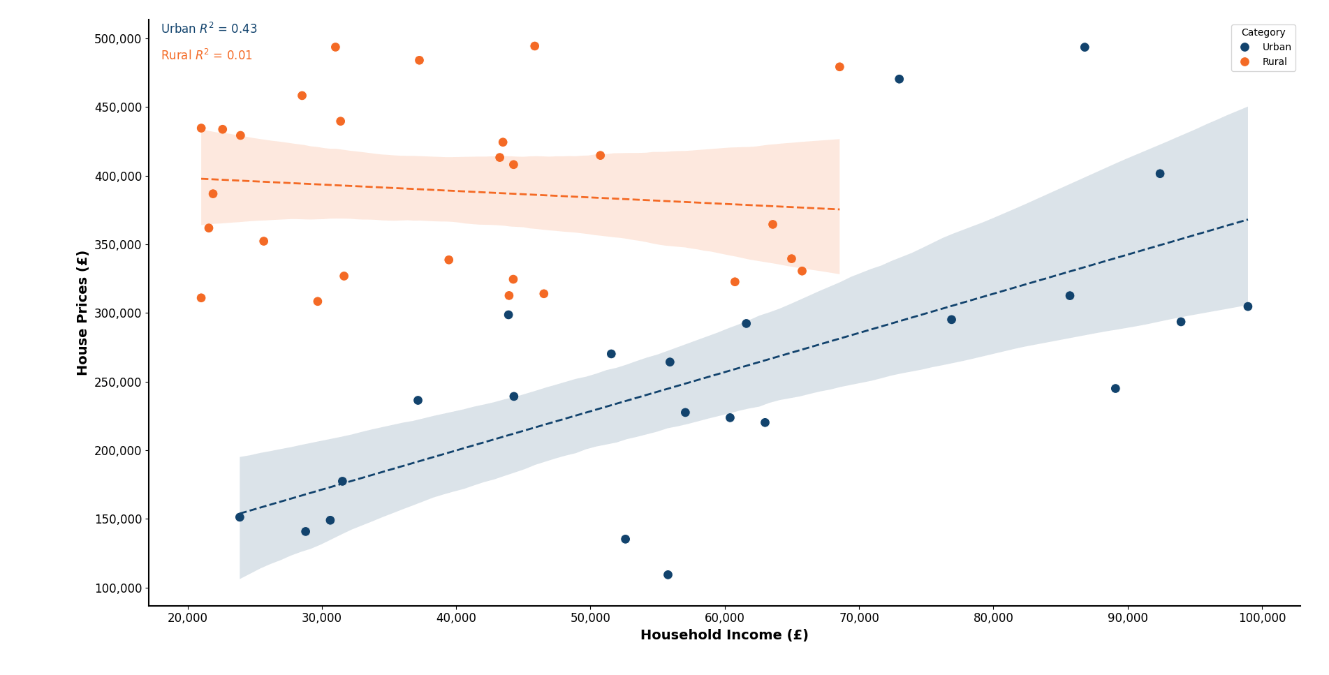
import matplotlib.pyplot as plt
import pandas as pd
import seaborn as sns
from sklearn.linear_model import LinearRegression
from sklearn.metrics import r2_score
import numpy as np
import matplotlib.ticker as mticker  # Import ticker for formatting

# Seed for reproducibility
np.random.seed(42)

# Create a DataFrame with a nuanced pattern
data = {
    'Category': np.random.choice(['Urban', 'Rural'], 50),  # Randomly assign categories
}

# Assign household incomes with Urban starting from 20,000 upwards
data['Household Income'] = [
    np.random.randint(20000, 100000) if cat == 'Urban' else np.random.randint(20000, 70000)
    for cat in data['Category']
]

# Assign house prices to be generally higher in Rural areas, lower in Urban areas
data['House Prices'] = [
    np.random.randint(300000, 500000) if cat == 'Rural' else np.random.randint(100000, 300000)
    for cat in data['Category']
]

# Convert to a DataFrame for easier manipulation
df = pd.DataFrame(data)

# Introduce a general correlation: Higher incomes should have higher house prices
# Modify 25% of the data points to ensure high income leads to high house prices
high_income_mask = df['Household Income'] > 70000
df.loc[high_income_mask, 'House Prices'] += np.random.randint(100000, 200000, high_income_mask.sum())

# Create a scatter plot with GOV.UK styling for two categories
fig, ax = plt.subplots(figsize=(10, 6))

# Plot scatter points by category with GOV.UK style colors
sns.scatterplot(x='Household Income', y='House Prices', hue='Category', data=df, s=100, ax=ax, palette=['#12436D', '#f46a25'])

# Calculate and plot separate linear trends and R² values for each category
for i, category in enumerate(df['Category'].unique()):
    # Filter data for each category
    category_data = df[df['Category'] == category]

    # Perform linear regression
    X = category_data[['Household Income']]
    y = category_data['House Prices']
    reg = LinearRegression().fit(X, y)
    y_pred = reg.predict(X)
    r2 = r2_score(y, y_pred)

    # Plot linear trend line for each category
    sns.regplot(x='Household Income', y='House Prices', data=category_data, scatter=False, ax=ax,
                line_kws={'lw': 2, 'linestyle': '--'}, color='#12436D' if category == 'Urban' else '#f46a25')

    # Display R² for each category with adjusted positions
    common_x_pos = df['Household Income'].min() - 3000  # Fixed x position for neat alignment
    y_pos = category_data['House Prices'].max()

    # Adjust R² label y position to avoid overlap and set x position to common_x_pos
    y_offset = 10000 if i == 0 else -10000  # Offset R² label: Up for Urban, Down for Rural
    plt.text(common_x_pos, y_pos + y_offset, f'{category} $R^2$ = {r2:.2f}', fontsize=12, color='#12436D' if category == 'Urban' else '#f46a25')

# Set the GOV.UK style labels and title
ax.set_xlabel('Household Income (£)', fontsize=14, weight='bold')
ax.set_ylabel('House Prices (£)', fontsize=14, weight='bold')

# Set the formatter for x and y axes to include commas
ax.xaxis.set_major_formatter(mticker.FuncFormatter(lambda x, _: f'{int(x):,}'))
ax.yaxis.set_major_formatter(mticker.FuncFormatter(lambda y, _: f'{int(y):,}'))

# Set the GOV.UK styling colors for axes and background
ax.spines['top'].set_visible(False)
ax.spines['right'].set_visible(False)
ax.spines['left'].set_linewidth(1.5)
ax.spines['bottom'].set_linewidth(1.5)
ax.spines['left'].set_color('black')
ax.spines['bottom'].set_color('black')

# Adjust tick parameters for GOV.UK styling
ax.tick_params(axis='both', which='major', labelsize=12, color='black')

# Show the plot
plt.tight_layout()
plt.show()
R Example
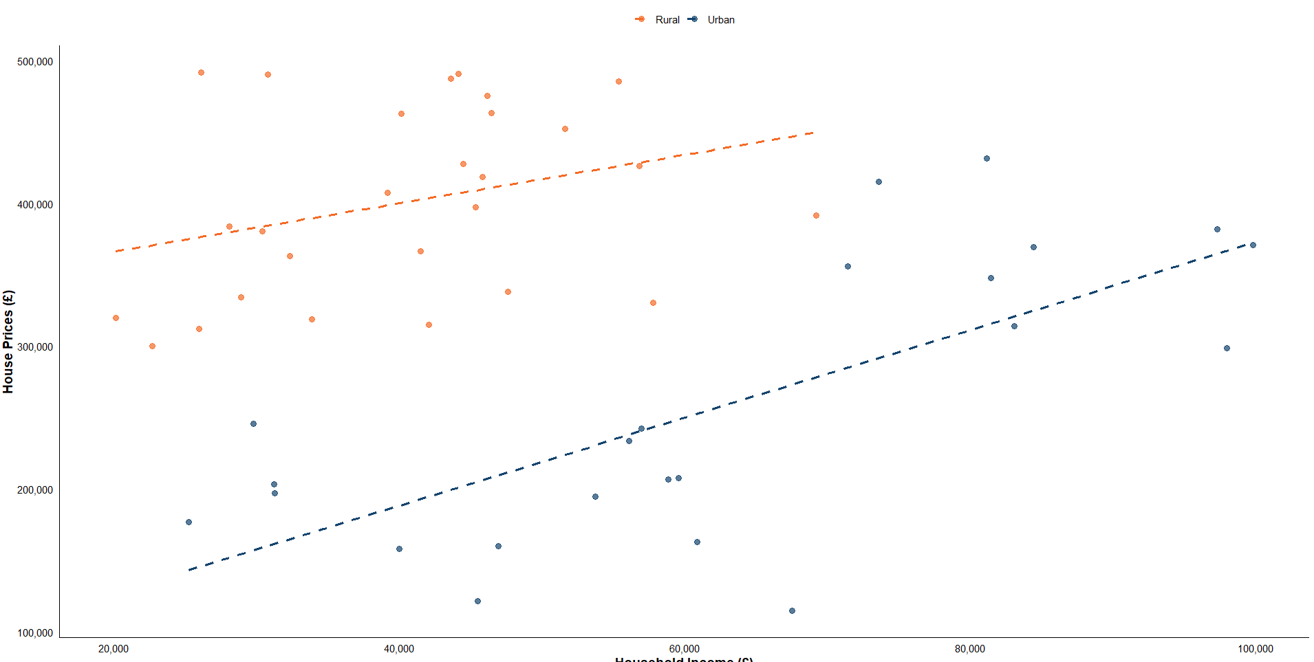
# Load required libraries
library(ggplot2)
library(dplyr)
library(broom)
library(scales)  # For comma formatting

# Set seed for reproducibility
set.seed(42)

# Create a DataFrame with a nuanced pattern
data <- data.frame(
  Category = sample(c("Urban", "Rural"), 50, replace = TRUE)  # Randomly assign categories
)

# Assign household incomes with Urban starting from 20,000 upwards
data$Household_Income <- ifelse(
  data$Category == "Urban",
  sample(20000:100000, 50, replace = TRUE),
  sample(20000:70000, 50, replace = TRUE)
)

# Assign house prices to be generally higher in Rural areas, lower in Urban areas
data$House_Prices <- ifelse(
  data$Category == "Rural",
  sample(300000:500000, 50, replace = TRUE),
  sample(100000:300000, 50, replace = TRUE)
)

# Introduce a general correlation: Higher incomes should have higher house prices
# Modify 25% of the data points to ensure high income leads to high house prices
high_income_mask <- data$Household_Income > 70000
data$House_Prices[high_income_mask] <- data$House_Prices[high_income_mask] + sample(100000:200000, sum(high_income_mask), replace = TRUE)

# Define the custom GOV.UK color palette
govuk_palette <- c(Urban = "#12436D", Rural = "#f46a25")

# Create a scatter plot with GOV.UK styling for two categories
ggplot(data, aes(x = Household_Income, y = House_Prices, color = Category)) +
  geom_point(size = 3, alpha = 0.7) +

  # Add separate linear trends and display R² values for each category
  geom_smooth(method = "lm", se = FALSE, linetype = "dashed", size = 1.2, aes(color = Category)) +

  # Apply the custom GOV.UK color palette
  scale_color_manual(values = govuk_palette) +

  # Custom labels and title
  labs(
    x = "Household Income (£)",
    y = "House Prices (£)",
    title = "House Prices vs. Household Income by Category"
  ) +

  # Custom styling for GOV.UK-like appearance
  theme_minimal(base_size = 14) +
  theme(
    panel.grid = element_blank(),  # Remove gridlines
    axis.line = element_line(color = "black", size = 0.5),
    legend.position = "top",
    legend.title = element_blank(),
    axis.text = element_text(color = "black"),
    axis.title = element_text(size = 14, face = "bold", color = "black")
  ) +

  # Format x and y axis labels with commas
  scale_x_continuous(labels = comma) +
  scale_y_continuous(labels = comma)

# Calculate separate R² values for each category and display them on the plot
r2_values <- data %>%
  group_by(Category) %>%
  summarise(R2 = summary(lm(House_Prices ~ Household_Income))$r.squared)

# Print R² values for reference
print(r2_values)
Choropleth Map
To create a choropleth map, we’ll use a geographical dataset (e.g., a geojson file of local authorities in the UK) and color regions based on employment rates.
Python Example
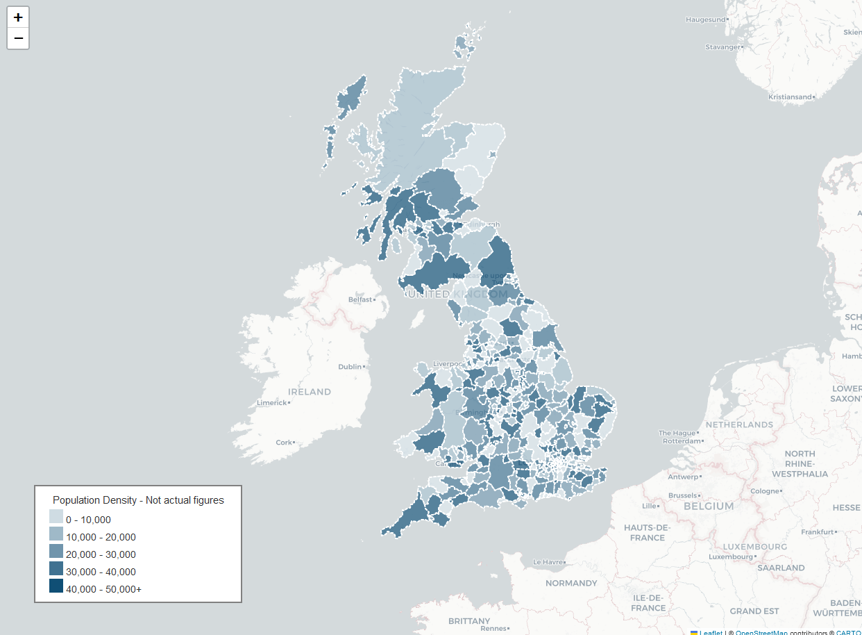
import folium
import requests
# URL to the GeoJSON file hosted on GitHub
geojson_url = "https://raw.githubusercontent.com/shedloadofcode/data-files/refs/heads/main/LAD_DEC_2021_GB_BFC.json"
# Fetch the GeoJSON data from the URL
response = requests.get(geojson_url)
geo_data = response.json()
# Define the custom color scale and class intervals for density
classes = [0, 10000, 20000, 30000, 40000, 50000]
colorscale = ['#cfdce3', '#9fb9c8', '#7095ac', '#407291', '#104f75']
# Create a Folium map centered around the UK with CartoDB's light background
m = folium.Map(location=[54.509865, -5.118092], zoom_start=6, tiles=None)
folium.TileLayer(
tiles='https://{s}.basemaps.cartocdn.com/light_all/{z}/{x}/{y}{r}.png',
attr='© <a href="https://www.openstreetmap.org/copyright">OpenStreetMap</a> contributors © <a href="https://carto.com/attributions">CARTO</a>'
).add_to(m)
# Define color based on density values
def style_function(feature):
density = feature['properties'].get('density', 0)
color = colorscale[0] # Default color
for i, cls in enumerate(classes):
if density > cls:
color = colorscale[i]
return {
'fillOpacity': 0.7,
'weight': 2,
'opacity': 1,
'color': 'white', # Default dashed border color
'fillColor': color,
'dashArray': '3'
}
# Highlight function to show black solid lines on hover
def highlight_function(feature):
return {
'weight': 3,
'color': 'black', # Change to solid black on hover
'dashArray': '', # Remove dashes on hover
'fillOpacity': 0.7
}
# Create the GeoJson layer with tooltips
geojson_layer = folium.GeoJson(
geo_data,
style_function=style_function,
highlight_function=highlight_function,
tooltip=folium.GeoJsonTooltip(
fields=['LAD21NM', 'density'],
aliases=['Region:', 'Density:'],
localize=True,
sticky=True,
style=("background-color: white; border: 1px solid black; border-radius: 3px; "
"box-shadow: 3px 3px 3px rgba(0,0,0,0.25); font-size: 16px; font-family: Arial;")
),
zoom_on_click=True
).add_to(m)
# Custom legend for density classes
legend_html = '''
<div style="position: fixed;
bottom: 50px; left: 50px; width: 300px; height: 170px;
background-color: white; z-index: 1000; border:2px solid grey; padding: 10px;">
<h4 style="margin:0; text-align: center;">Population Density - Not actual figures</h4>
<div style="padding: 5px 10px;">
<div style="background-color: #cfdce3; width: 20px; height: 20px; display: inline-block;"></div> 0 - 10,000<br>
<div style="background-color: #9fb9c8; width: 20px; height: 20px; display: inline-block;"></div> 10,000 - 20,000<br>
<div style="background-color: #7095ac; width: 20px; height: 20px; display: inline-block;"></div> 20,000 - 30,000<br>
<div style="background-color: #407291; width: 20px; height: 20px; display: inline-block;"></div> 30,000 - 40,000<br>
<div style="background-color: #104f75; width: 20px; height: 20px; display: inline-block;"></div> 40,000 - 50,000+<br>
</div>
</div>
'''
# Add the legend to the map
m.get_root().html.add_child(folium.Element(legend_html))
# Save the map as an HTML file
m.save('choropleth_map.html')
print("Map saved as 'choropleth_map.html'")
When it comes to working with GeoJSON and Shapefiles, Mapshaper is great tool to use so keep it in mind! To learn more check out this useful guide to Edit and Join with Mapshaper.
You can alternatively perform this process in Python or R itself, but the steps are the same:
- Get a Shapefile or GeoJSON file from the ONS Open Geography Portal
- Get some data
- Join the data and the Shapefile or GeoJSON file on area ID - or any ID they both contain
- Output as a GeoJSON file
- Use that GeoJSON file in the leaflet map - referencing the 'columns' you want
Best Practices for GOV.UK Style Charts
To start, here are some basic tips:
- Use GOV.UK brand colors (
#005EA5for blue,#007F3Bfor green,#FFDD00for yellow). - Ensure text and lines are clear and readable.
- Avoid using distracting elements such as 3D effects.
- Use contrasting colors and appropriate labeling for accessibility.
- Maintain consistent font sizes and styles.
Now going into more detailed guidance:
-
This official GOV.UK visual content guidelines page provides examples of bar charts, line charts, tables, and various image formats used across GOV.UK web pages. It also discusses best practices for creating accessible and visually appealing charts in the GOV.UK style.
-
The Government Analysis Function has a detailed collection of case studies that show how to improve charts for public communication. They include practical tips like focusing on narrative, using GOV.UK color schemes, and adding annotations to guide the viewer through the data.
-
The ONS Data Visualisation Service Manual provides detailed guidance on best practices for creating clear and accessible charts, tables, and maps. It covers visual conventions, color usage, and building specifications, making it an excellent reference for creating high-quality and consistent visual content in line with ONS and GOV.UK standards. This resource is ideal for developers and analysts looking to create professional, standardised visualisations.
Finally, some specific examples I found of visualisations:
- This RShiny GOV.UK styled dashboard template contains examples of tables, line charts, and bar charts. [Code]
- Slides, datasets and transcripts to accompany coronavirus press conferences
Conclusion
This guide has shown how to create accessible and visually consistent GOV.UK style charts using Python and R. Whatever analysis you are presenting, the lessons learnt from producing these visuals can help you to communicate insights simply and effectively.
I will be covering more advanced and complex charts in a future article, to cover things like detailed comparisons, forecasting, visualising uncertainty and more.
If you enjoyed this article be sure to check out other articles on the site 👍 you may be interested in:


